Band Structure
I could do band structure by plotting the eigenvalues of a matrix parametrized as a function of k. And I have.
However, a more general method, and truer to physical reality, is to not assume a perfect lattice. Just write down the real space hamiltonian, diagonalize it, and then somehow find the right plot in there.
I think a good way of thinking about it is that density matrices exist. Then you may massage them to get what you want.
In particular, a good plot is the density matrix $ \rho_E (k,k) $ This is an object who . You will want to smooth out on E. I used a Cauchy distribution. There are reasons to do so. I’ll get to them later.
What I’m doing is all ad hoc, although I’ll make it better.
The dispersion relation is plotted in kind of an extended Brillouin scheme. I need to think if that’s what I want.
In order to get bands, we need to plot level sets of this density matrix. Maybe integrate with respect to energy first.
Another thing that might be fun to do is the try to show the band structure changing as a function of position. Similar problems to windowed Fourier analysis.
import numpy as np

import scipy as sp
from scipy import linalg as spLA
import matplotlib.pyplot as plt
from mpl_toolkits.mplot3d import Axes3D
from matplotlib import cm
from numpy import linalg as LA
from matplotlib.ticker import LinearLocator, FormatStrFormatter

N = 100

t1 = 1.5
t2 = -0.5

bands = 2

C =np.roll(np.eye(N),1,axis=0) # circulant off diagonal matrices
CT = np.transpose(C)

temp = np.zeros(N)
temp[1] = 1.0
T = spLA.toeplitz(temp, np.zeros(N))

tunnel = np.array([[0,t1],
				   [0,0]])
cell = np.array([[0.0, t2],
				 [t2, 0]])


H = np.kron(np.eye(N),cell) + np.kron(T,tunnel) + np.transpose(np.kron(T,tunnel))


energies, wavefunctions = LA.eig(H)

a = 1.0
ks = np.fft.fftshift(np.fft.fftfreq(bands*N,d=a))

es = np.arange(2*min(energies), 2*max(energies), 0.1)
K, E = np.meshgrid(ks, es)
wavefunctions_k = np.fft.fftshift(np.fft.fft(wavefunctions,axis=0), axes=(0,))

rho_kk = np.abs(wavefunctions_k) ** 2

def smoothing(e,E):
	return 1./((e-E)**2 + 0.1)
print E.shape
rho = np.zeros( E.shape )
print energies.shape

for j in range(len(es)):
	e = es[j]

	rho[j,:] = np.einsum("j,kj" , smoothing(energies,e) , rho_kk)


def compressbrillouin(rho, axis=1):
	n = rho.shape[axis]
	return rho[:,:n/2] + rho[:,n/2:]

plt.pcolormesh(K, E, rho)
plt.show()
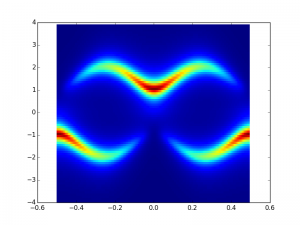
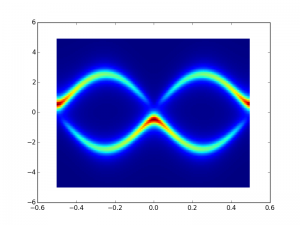
The difference between these two is t2 or t1 being larger in magnitude around the t1=-t2 point. You can see the inversion of the bands. The more constant-like wavecetor flips up to the top band, once flip flopping becomes energetically favorable.
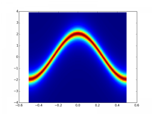
This is two bands. The y axis is energy. The x axis is wavevector. There is a gapped region.
It is interesting to see what happens when you tune the parameters.
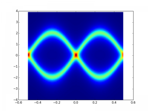
t1 = t2
t2=-t1
It is this point where the flip from a clockwise to counterclockwise encirclement of the origin occurs when the unit cell is expressed as psuedospin. Winding number change. Changing the band topology.
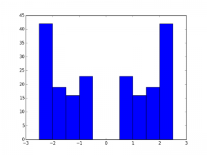
Trivial energy histogram
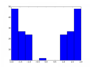
Nontrivial histogram. 2 Edge states in the gap. Both are exactly at zero. (well off by a factor of 10^-15 anyhow)
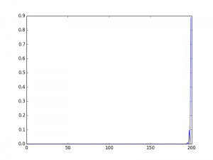
Here’s a real space plot of one of the deg states. Its that huge spike in the corner
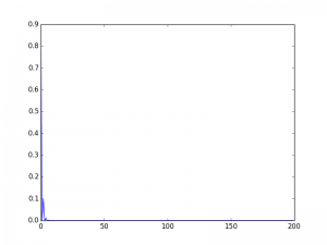
Here’s the other edge state
Pretty neat
